
3 Giant Mistakes That Stop Your Website From Making Money
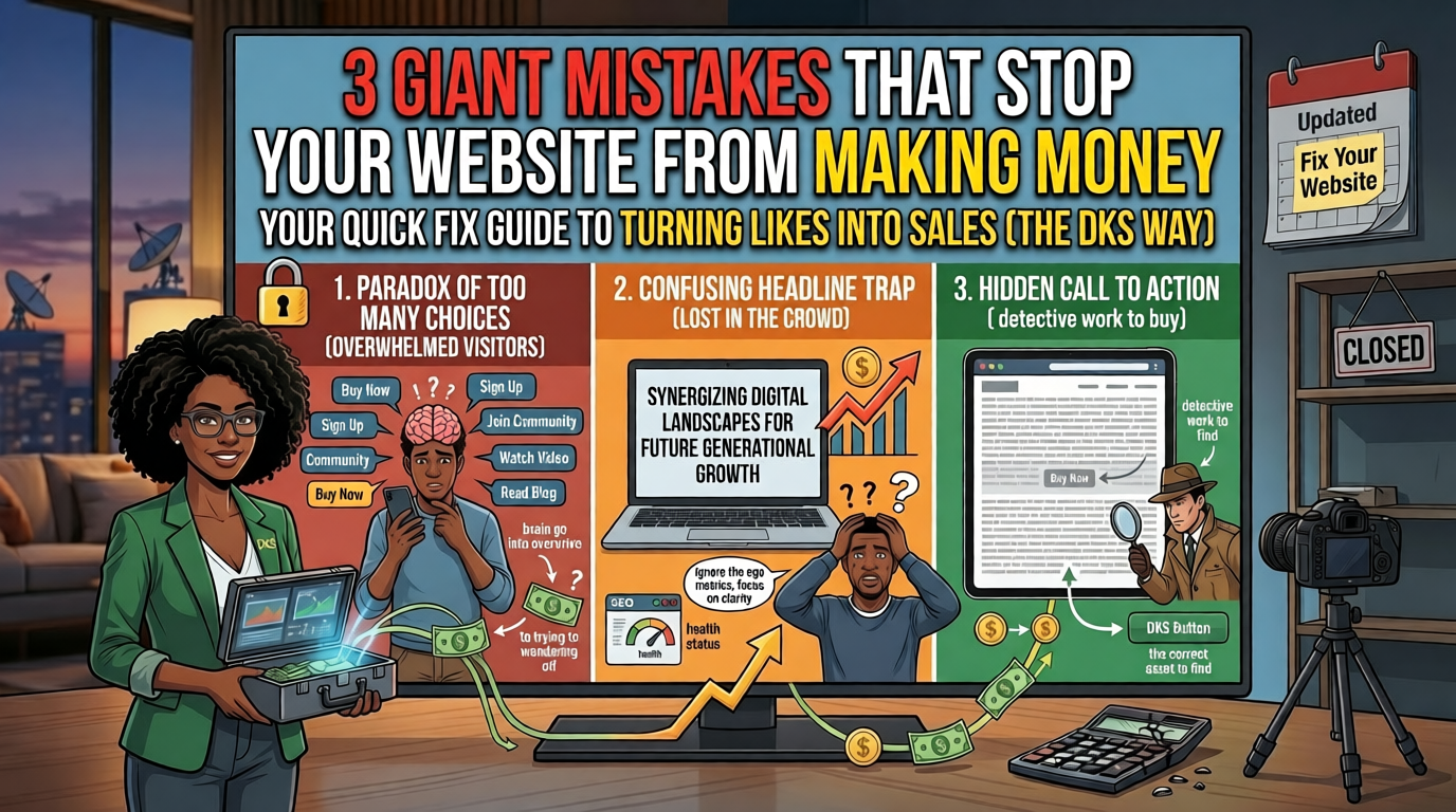
3 Giant Mistakes That Stop Your Website From Making Money
Let’s play out a quick scenario. You did everything right. You stopped chasing useless social media likes, you built an offer, and you finally managed to get actual, living human beings to click on your link. Maybe you ran a couple of Meta ads, or maybe you shared your link in a massive community group.
Either way, the traffic is coming in.
You look at your dashboard. Ten people visited. Fifty people. A hundred people.
But your phone hasn’t chimed with a single sale notification. Nothing. Just an empty shopping cart and a high bounce rate.
It is incredibly frustrating. You start wondering if your product is bad, or if your prices are too high. But most of the time, the problem isn’t your product at all. The problem is your landing page. It’s leaking money.
If your goal is to convert website visitors into customers, you need to realize that a website isn’t an online art gallery. It’s a sales funnel. And right now, you might be making a few silent mistakes that are driving your audience straight into the arms of your competitors.
Let’s look at the three giant blunders you need to fix immediately.
1. 3 Giant Mistakes The Paradox of Too Many Choices
When a brand-new visitor lands on your page, they should have exactly one job to do. Buy the product, sign up for the trial, or drop their email. That’s it.
But walk into most messy startup websites, and what do you see? A sliding banner, five different product categories, a blog link, an “About Us” story, and three different social media icons blinking at the bottom.
It is absolute chaos.
When you give people too many options, their brains completely freeze up. They get overwhelmed, they close the tab, and they go back to scrolling videos. According to conversion data published on Clutter is the absolute number one killer of online sales. Keep it stupidly simple. One clear offer. One clear path.
2. The Confusing “Headline” Trap
You have exactly less than five seconds to capture someone’s attention when they click your link. If they can’t figure out what you sell within those five seconds, they are gone forever.
Too many founders try to sound incredibly smart or poetic with their headlines. They write things like, “Synergizing digital landscapes for future generational growth.” What does that even mean? No one knows.
Your headline needs to be bone-simple. What is the problem, and how do you solve it? If you sell a 15-minute meal prep kit for busy moms, your headline should say: “Healthy, chef-designed meals on your table in under 15 minutes.” Boom. Instantly clear. Don’t make people guess.
3. The “Hidden” Call to Action
Your Call to Action (CTA) is the button you want people to click. “Buy Now,” “Get Started,” “Claim Your Kit.”
You would be shocked at how many websites hide this button at the very bottom of a massive wall of text. Or worse, they make the button blend into the background. If your website background is white, and your CTA button is a light gray text link, nobody is going to see it.
Your button needs to pop out like a sore thumb. It needs to look like a physical button that begs to be pushed. And it needs to appear multiple times as the user scrolls down the page. Don’t make your customers do detective work just to give you their money.
Shifting to the DKS Blueprint
Fixing all these technical, psychological details by yourself can turn into a massive headache, especially if you aren’t a seasoned copywriter or web designer. You can end up wasting weeks tweaking padding sizes instead of making money.
This is exactly why Darryl’s Dream Kit System (DKS) was built.
The system strips away the overcomplicated layout nonsense. It stops you from building multi-page labyrinth websites and forces you into a high-converting, single-page structure. The DKS blueprint is engineered from day one to convert website visitors into customers by organizing your visual assets, sharpening your headline messaging, and placing your buttons exactly where they need to be.
Stop Guessing, Start Selling
A pretty website that doesn’t sell anything is just an expensive hobby. You deserve a business that actually pays your bills.
Stop overcomplicating your layout. Fix your headlines, kill the extra distractions, and make your buying buttons loud and clear.
If you want to skip the frustrating trial-and-error phase completely, head over to “https://dreamkitsystem.com/” right now. Grab the system, apply the exact blueprints to your online business, and turn your quiet landing page into a client-converting machine.

